DATA ANALYST PORTFOLIO
Project 5
Workforce Insight Navigator (HR Analysis) || Power BI
In today's ever-changing workplace, it's super important for companies to really know what's going on with their employees. That's where the HR Dashboard comes in – it's like a treasure hunt into the details of who's working, why some folks leave, and how everyone's feeling.
Think of it as a special tool to help businesses handle tricky stuff like keeping talented people around, making sure there's a good mix of different folks, and looking out for everyone's well-being. Imagine having a magic lens that turns piles of numbers into super useful insights.
This project is like a guidebook for leaders and HR folks, showing them the ropes of what makes their team tick. It's not just about the stats; it's about understanding the heartbeat of the workplace. By using this data, organizations can make smart decisions to create a workplace where everyone – from the company to the employees – can do their best.
Objective
The objective of this project was to create a comprehensive HR dashboard in Power BI, providing valuable insights into employee demographics, turnover analysis, and wellness within the organization. The dashboards aim to empower decision-makers with actionable information for effective workforce management, retention strategies, and overall employee well-being.
Chapter 1: Data Preprocessing
Before diving into the dashboards, meticulous data preprocessing was conducted. Redundant columns were removed, null values were addressed, and duplicates were eliminated. Additionally, columns were appropriately renamed in the Power Query Editor of Power BI, ensuring a clean and organized dataset for insightful visualizations.
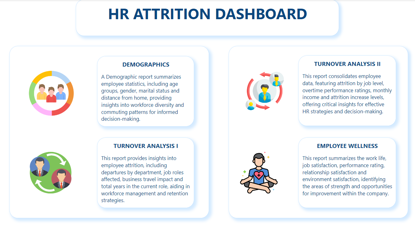
Chapter 2: Overview Dashboard
The first dashboard serves as a gateway, offering a brief preview of the four subsequent dashboards.
-
Demographics Dashboard:
Unveiling the diverse facets of the workforce, this dashboard covers age groups, gender, marital status, and distance from home, shedding light on the organization's diversity and commuting patterns.
-
Turnover Analysis I Dashboard:
Delving into attrition details, this dashboard dissects departures by department, job roles, business travel impact, and total years in the current role, aiding in effective workforce management.
-
Turnover Analysis II Dashboard:
Consolidating employee data, this dashboard features attrition by job level, overtime, monthly income, and performance ratings, providing crucial insights for strategic decision-making.
-
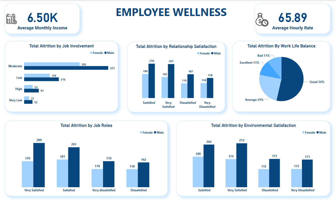
Employee Wellness Dashboard:
Focused on employee well-being, this dashboard examines work-life balance, job satisfaction, performance ratings, and relationship/environment satisfaction, identifying areas of strength and improvement within the company.
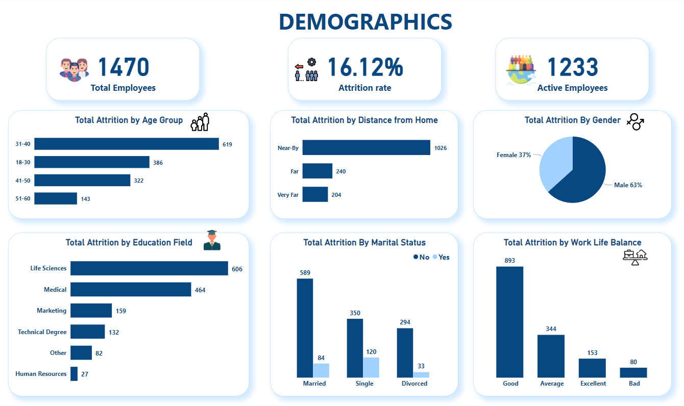
Chapter 3: Demographics Dashboard
Created key performance indicators (KPIs) for total employees, attrition rate, and total active employees. Utilized data groups to organize and visualize data, presenting charts on attrition by age group, distance from home, gender, education field, marital status, and work-life balance.
Key Insights:
- Attrition rate stands at 16.12%, leading to a decrease in total active employees from 1470 to 1233.
- Most significant attrition observed in the 31-40 age group.
- Life sciences lead in attrition by education field.
- Gender-wise, 37% females and 63% males experienced attrition.
- Married employees exhibit lower attrition rates.
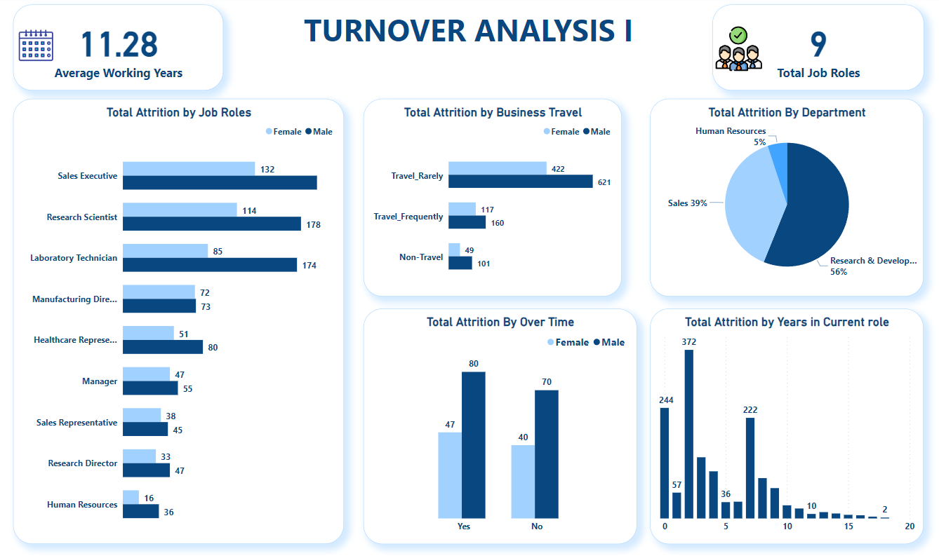
Chapter 4: Turnover Analysis I Dashboard
Developed KPIs for average working years and total job roles. Employed data groups for organizing data, leading to the creation of bar charts, column charts, and clustered column charts depicting attrition by job roles, business travel, overtime, department, and years in the current role.
Key Insights:
- Average working years is 11.28.
- Sales executive roles witness the highest attrition.
- Research and development department experiences a substantial 56% attrition rate.
- Men, on average, have more overtime, correlating with higher attrition.
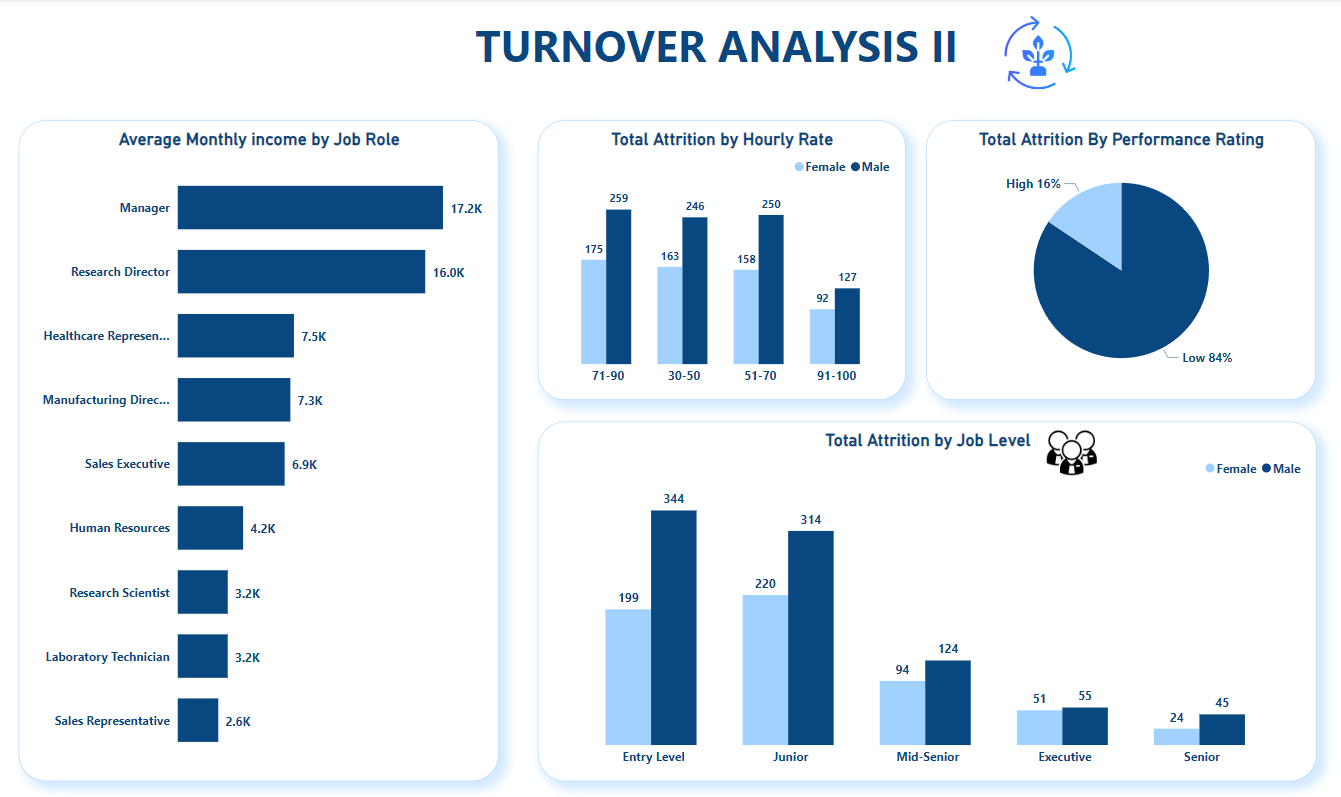
Chapter 5: Turnover Analysis II Dashboard
Generated charts representing total attrition by job role, job level, hourly rate, and performance rating, offering insights into managerial and performance-related aspects of attrition.
Key Insights:
- Managers face the highest attrition, followed by sales directors.
- Men, with higher hourly rates, also experience higher attrition.
- Employees with low performance ratings exhibit an 84% attrition rate.
Chapter 6: Employee Wellness Dashboard
Crafted KPIs for average monthly income and average hourly rate. Created charts representing total attrition by job involvement, job roles, relationship satisfaction, and environmental satisfaction, providing a holistic view of employee well-being.
Key Insights:
- Average monthly income is $6.50k, and the average hourly rate is $65.89.
- Employees with good work-life balance have the highest attrition at 54%.
- Highly satisfied employees have a higher attrition rate.
- Men are more moderately involved in their jobs compared to women.
 See Code Here!