Project-4
Screen Gems: Analyzing Netflix's Content || Tableau

In a world where deciding what to binge-watch is as crucial as choosing your next meal, Netflix stands as the undisputed hero. It's not just a streaming platform; it's a cultural phenomenon, the unsung hero of countless procrastination stories.
As I found myself lost in the vortex of Netflix's endless content options, a thought crossed my mind - could the data behind this entertainment behemoth hold secrets? Thus, armed with curiosity and a touch of humor, I dived into the vast sea of Netflix's offerings armed with Tableau, the data explorer’s trusty sidekick.
Objective:
The mission was to peel back the layers of Netflix's fame and reveal the insights hidden in its content library. It's like being handed the keys to a candy store and wondering, "What's the most popular flavor?"
Key Concepts and Insights:
-
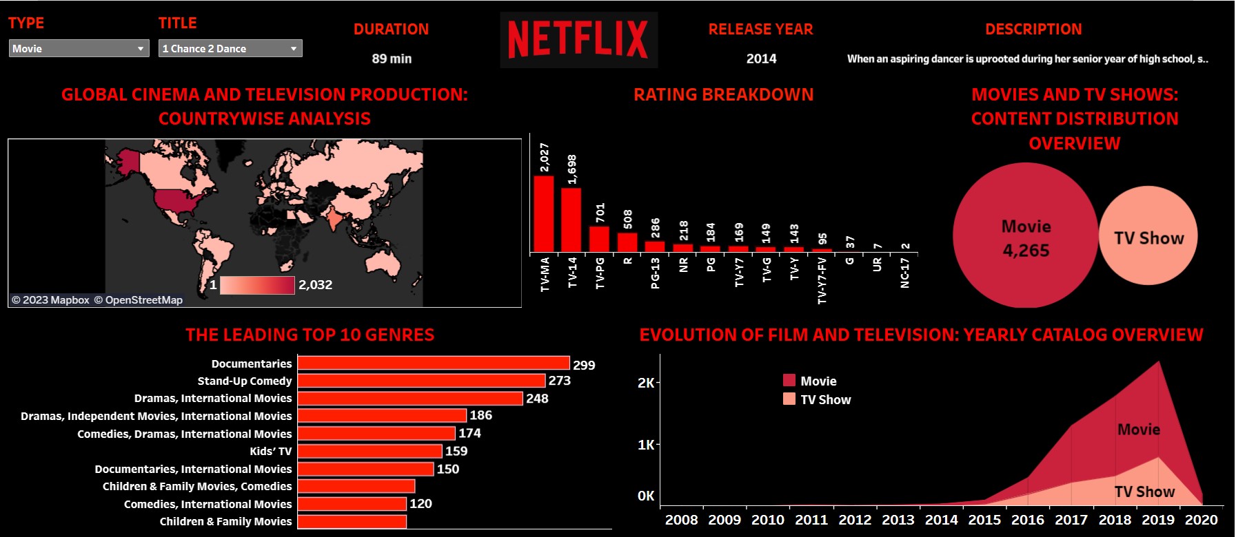
Global Movie Magic:
Ever wondered where the magic of Netflix is brewed? Spoiler: a lot in the USA. My world map visualization made it clear that Hollywood isn't just a place; it's a Netflix production hub.
-
Genre, the Spice of Life:
Genres are like spices; some are a hit, others... not so much. My bar chart spilled the beans on Netflix's favorite flavors, with documentaries and stand-up comedy taking the crown. Family movies, well, they're like that spice you bought but never used.
-
Rating Drama:
Ratings on Netflix are like the dramatic twists in your favorite show. 'TV-MA' stole the spotlight, making you question your life choices, while 'NC-17' played the mysterious, elusive character.
-
Time-Traveling Through Shows:
The evolution of Netflix's content library over the years is like watching a series grow from season one to a blockbuster season. The area chart revealed a steady rise, with 2020 being the unexpected plot twist – who knew so much content could be birthed in a single year?
-
The Movie-TV Tango:
Netflix's content distribution is a dance between movies and TV shows. The circle charts twirled and revealed that movies lead the dance floor with a 68.42% sway, leaving TV shows to follow with a 31.58% shuffle.
-
Interactive Netflix Magic Wand:
Enter the magical world of filters – a Netflix magic wand in the data realm. With filters for content type, title, duration, release year, and description, users could weave their own data tales.
In this data odyssey, the story unfolds not just as a series of numbers and charts but as a comedy-drama of Netflix's rise to fame, unveiling the quirks and patterns that make it the reigning champion of the streaming universe. As they say, the best stories are the ones backed by data, sprinkled with a dash of humor, and Netflix's story is no exception.